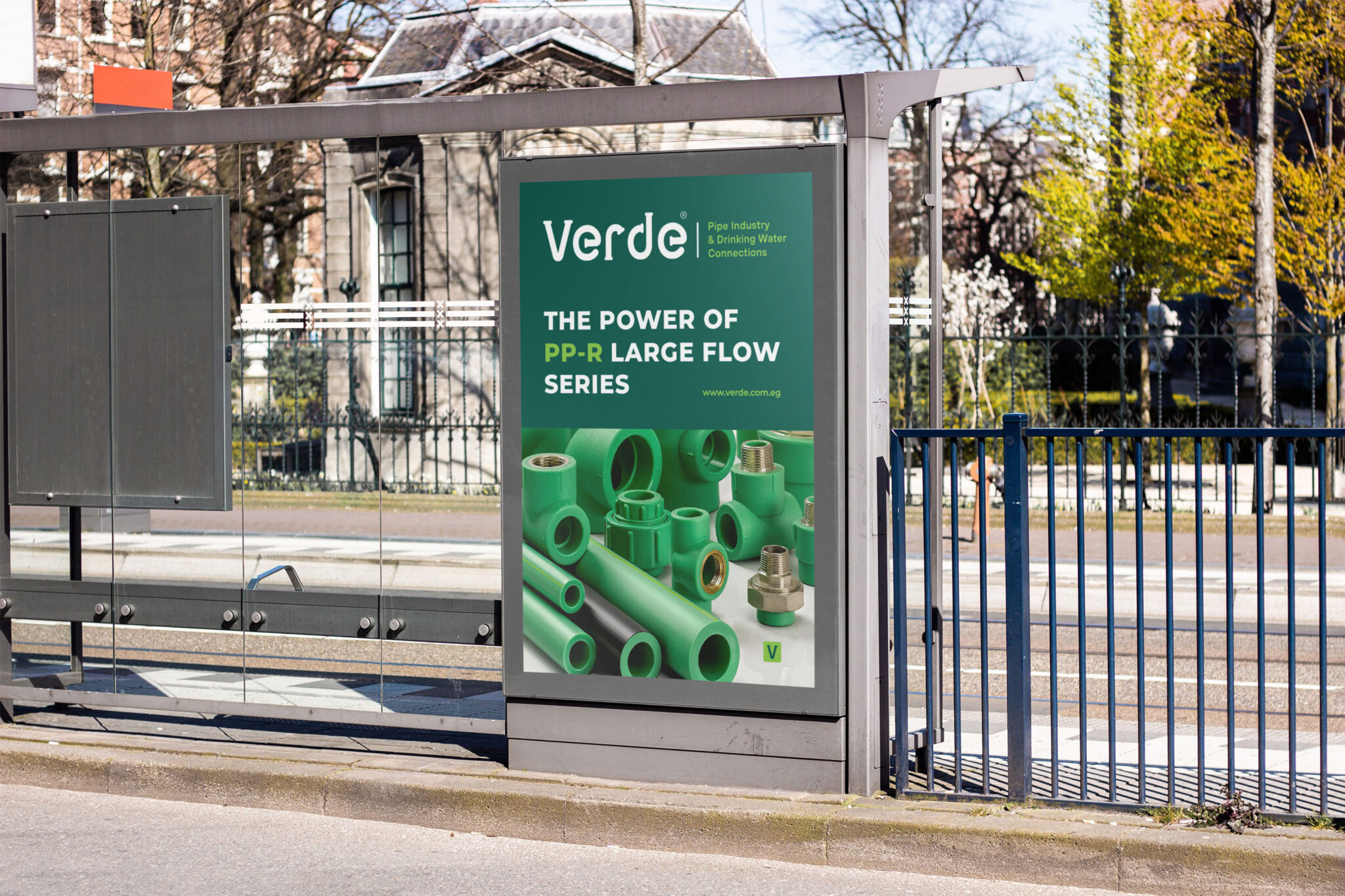
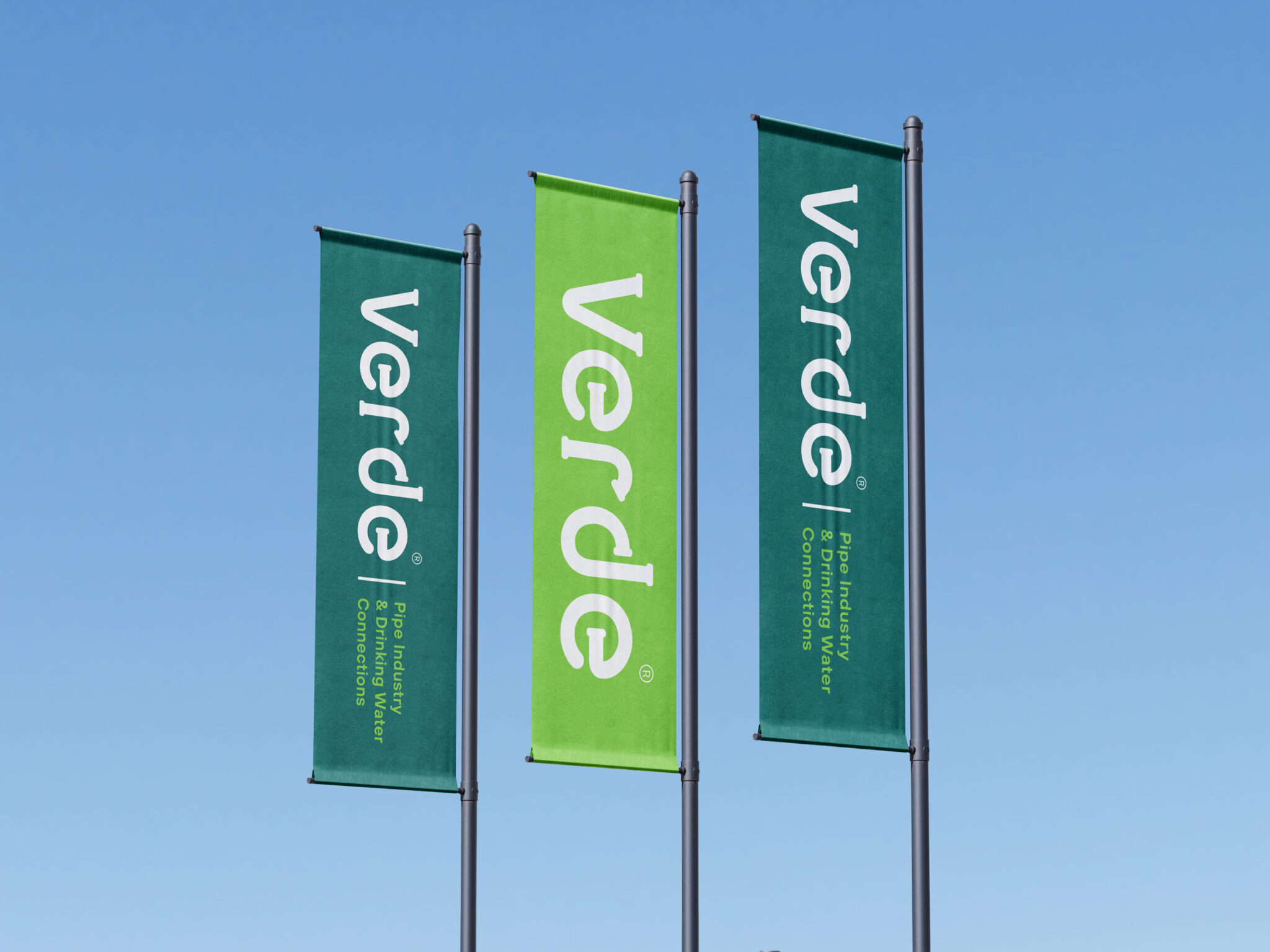
Verde had its roots deep in the craft of water pipes – a sector not often seen as innovative.
The challenge was significant. Verde needed a new logo that would carry the weight of its heritage and leap into the modern era. We took a creative ride, knowing full well that transforming the image of a company set in its old-school ways would be challenging.
Water pipes are crucial, yet they’re not associated with eye-catching designs or even logos. Our mission was to craft a letter that would not only stand out but also educate about what the company is really doing. We asked ourselves, “How do we thread what we do into a logo that speaks volumes without saying a word?” Then came the brainstorming sessions, where many coffee cups were emptied, and whiteboards filled with sketches. We wanted a logo that tells a story, one that shows immediately that Verde is about water pipes. The breakthrough came with a simple bend in a letter, a curve that mirrored the arc of a pipe. But this was not just any pipe; it was a stroke of green – a choice of color that crowned the name of Verde.
Previous
Next
Concept
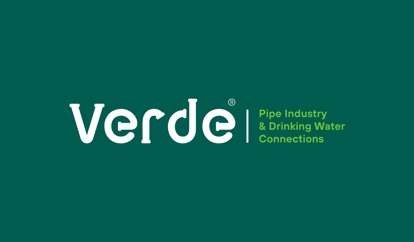
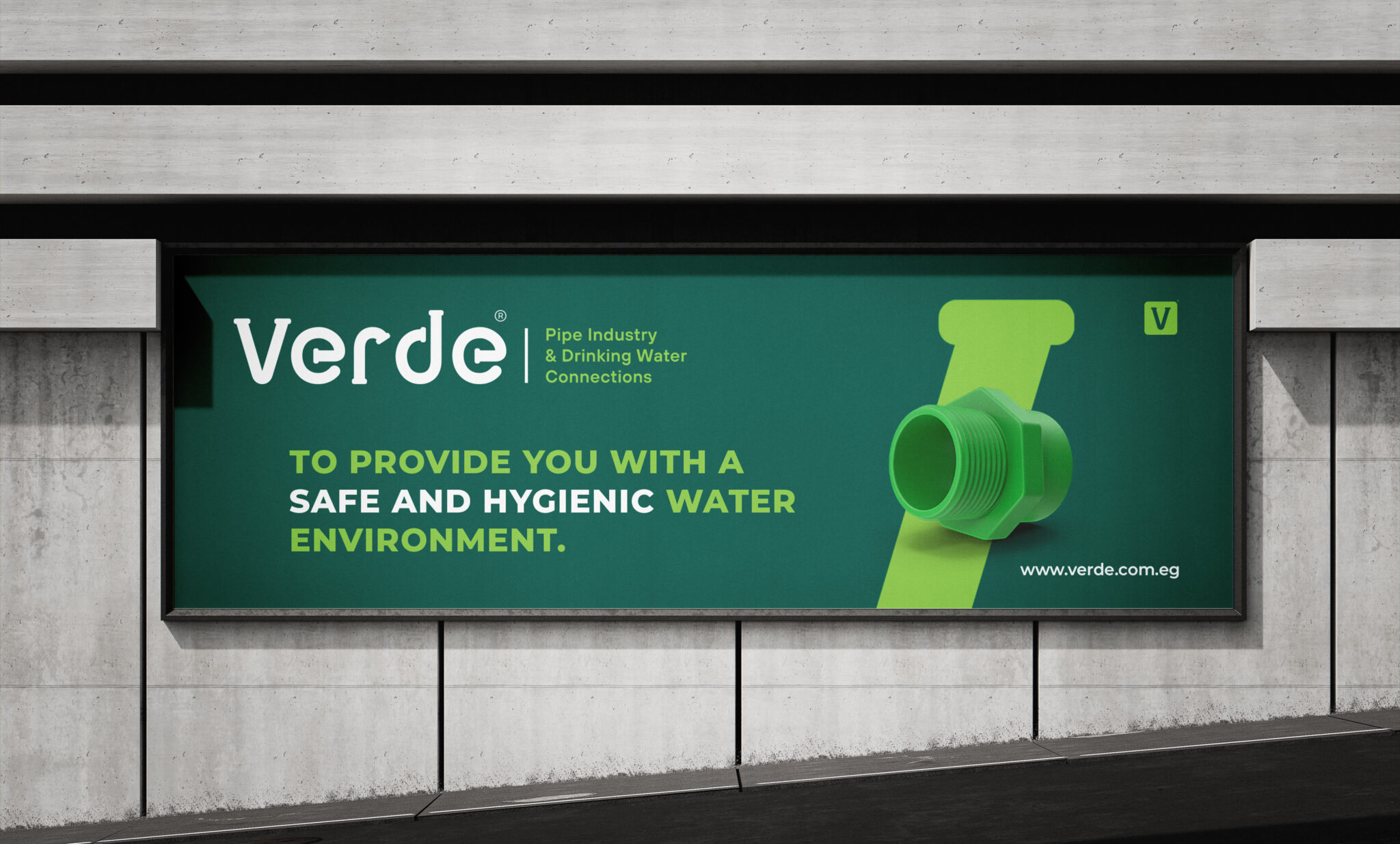
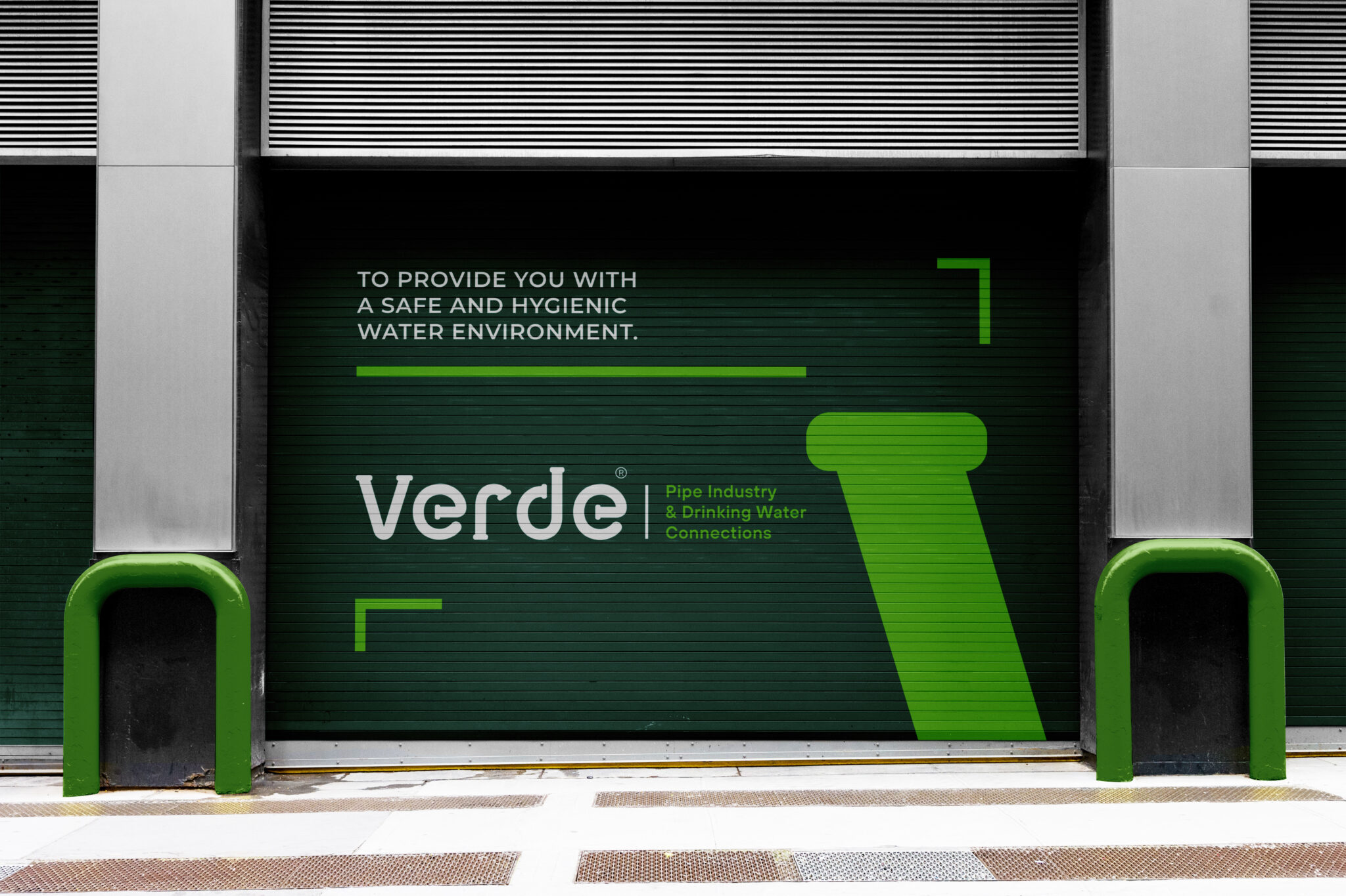
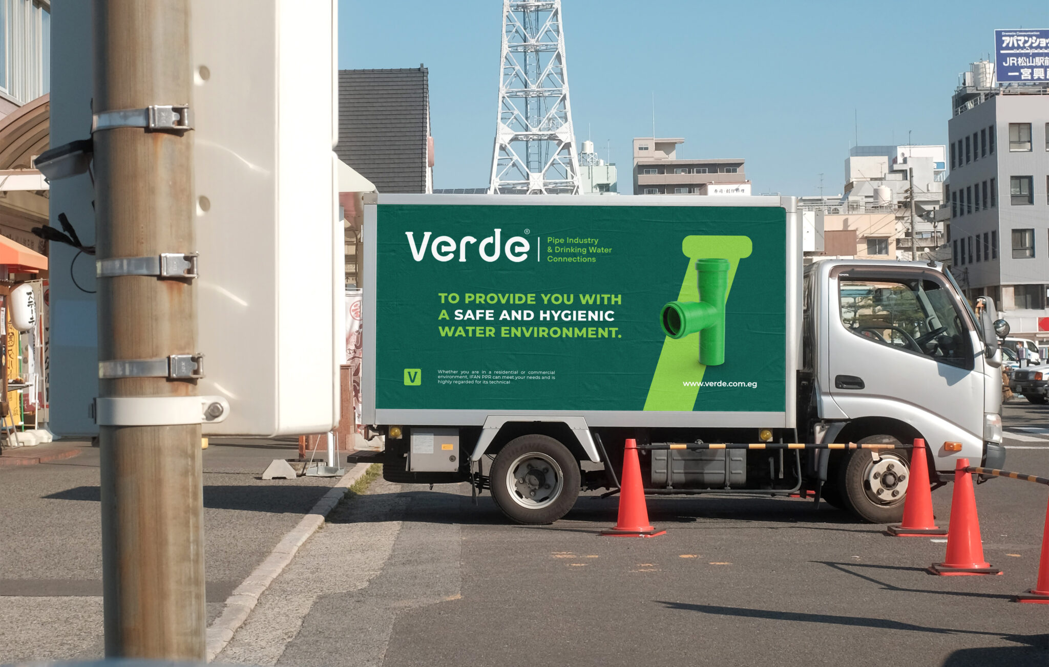
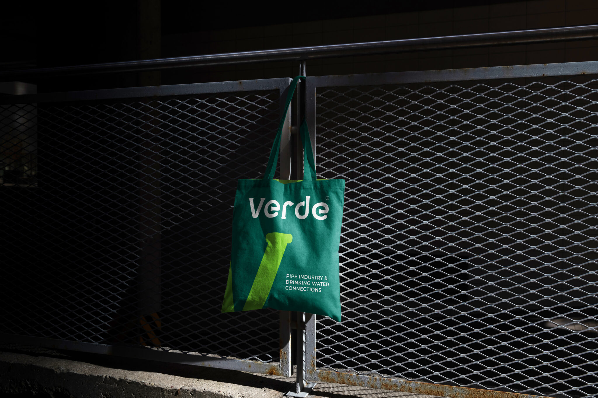
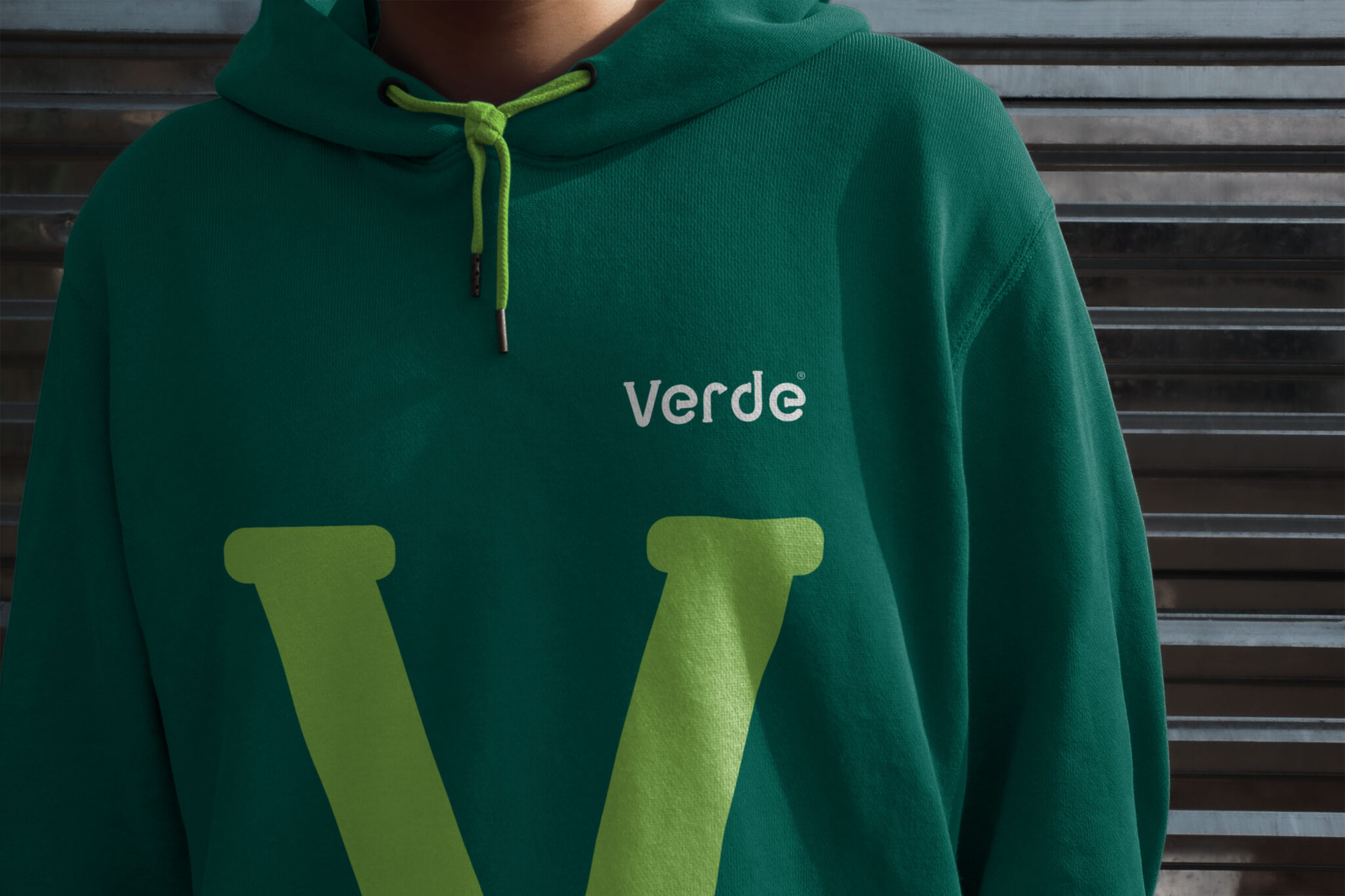
The Verde logo stands as a testament to creative brilliance, cleverly blending pipes into its design.
The logo for "Verde" cleverly integrates the concept of a pipe into the typography.
The letters mimic the shape of a curved pipe, which immediately ties the logo to the company's product pipes for water.
It's a visual story of commitment, innovation, and the seamless blend of function with meaning.
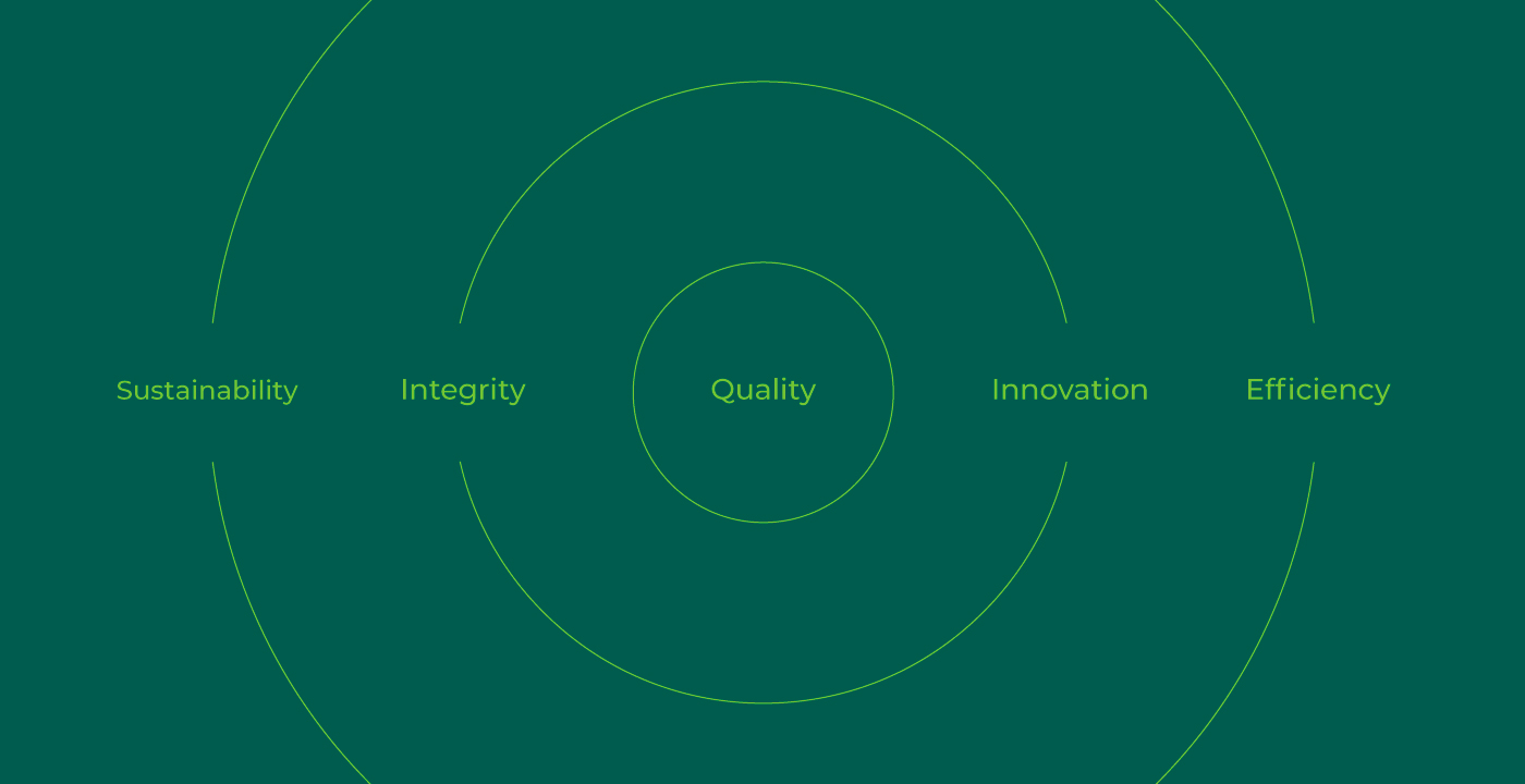
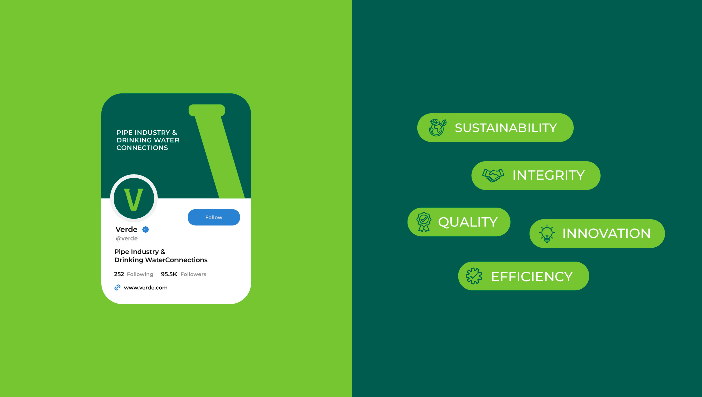
Core Values
We Developed a new Core value to Establish the brand with its new strong vision in the industry.
Sustainability: Commitment to eco-friendly practices in manufacturing and innovation, ensuring minimal environmental impact.
Integrity:Ensuring honesty and transparency in all business dealings, reflecting the clarity and purity of water.
Quality:Delivering high-standard, durable products that stand the test of time, much like the enduring nature of their pipes.
Innovation:Continual improvement of products and processes to provide state-of-the-art water solutions.
Efficiency:Streamlining processes to conserve resources and energy, reflecting the efficient flow of water through their pipes.
Impact
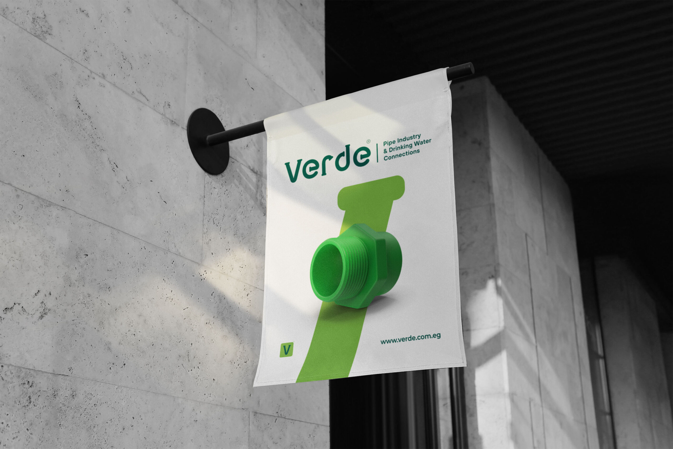
It's not just any letter – it's shaped like a water pipe.
This isn't just a fun design trick. It tells a story about what Verde stands for a love for our planet and a dedication to keeping our water flowing smoothly.
The green color is a nod to nature, reminding us that Verde is all about eco-friendly choices. It’s like the company is giving a green thumbs up to a healthier earth. So, every time you spot that green pipe letter, remember, it’s Verde’s way of saying we’re in this together, for cleaner water and a happier planet.
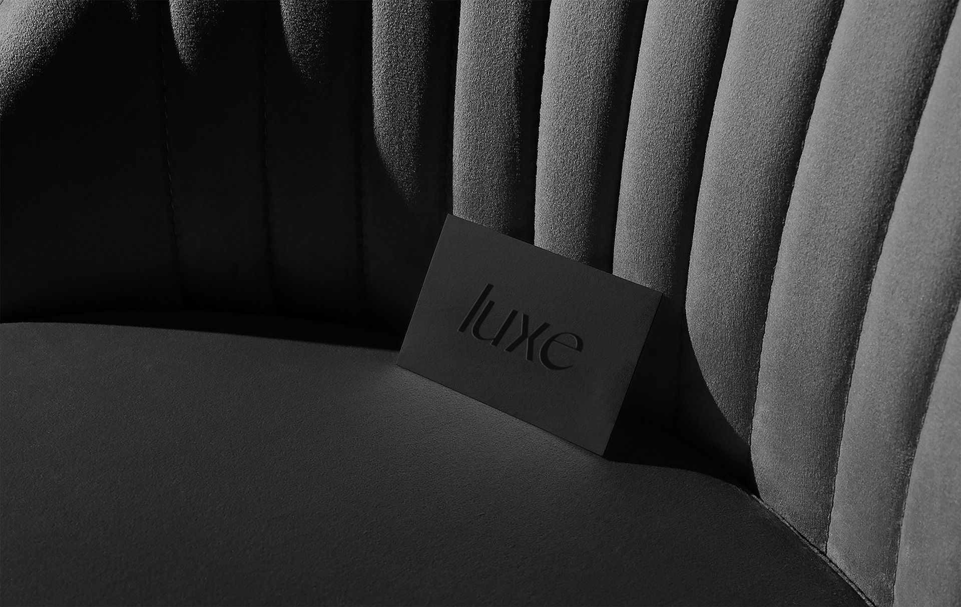
Sculptured Emotions
The simplicity of the design, with a clean, typo, underscores a modern and efficient approach, which may be reflective of the company's values or the quality of the products they manufacture.
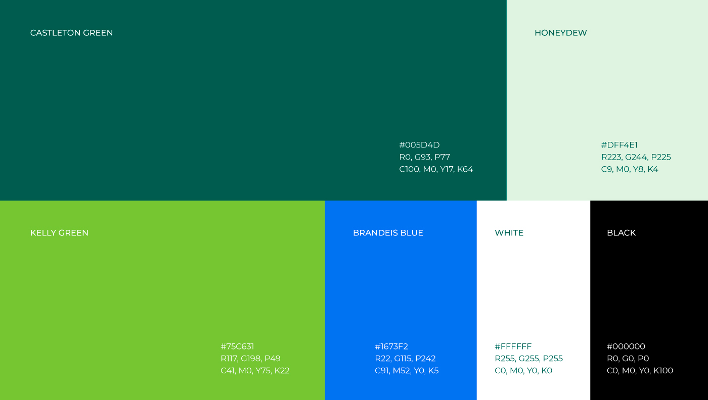
Colors Concept
The use of a vibrant green color for the logo not only plays on the word "Verde," which means green in several languages, but also suggests themes of freshness, eco-friendliness, and the flow of water.
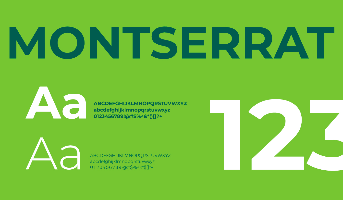
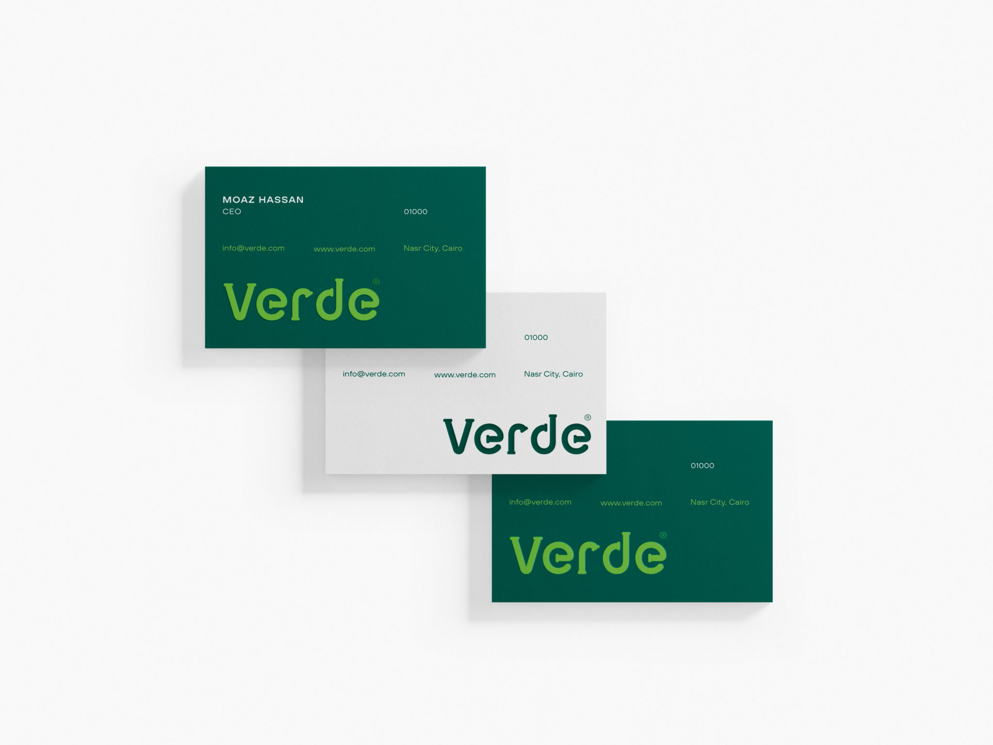
Typography style
Montserrat is a geometric sans-serif
typeface designed by Argentine graphic designer Julieta Ulanovsky and released in 2011.
It was inspired by posters, signs, and painted windows from the first half of the twentieth century, seen in the historic Montserrat neighborhood of Buenos Aires. This typeface offers a total of 17 weights, but we advise utilizing the following: Thin, Light, Regular, Medium, Semibold, Bold, and Black.