

Onwan Interiors
Details
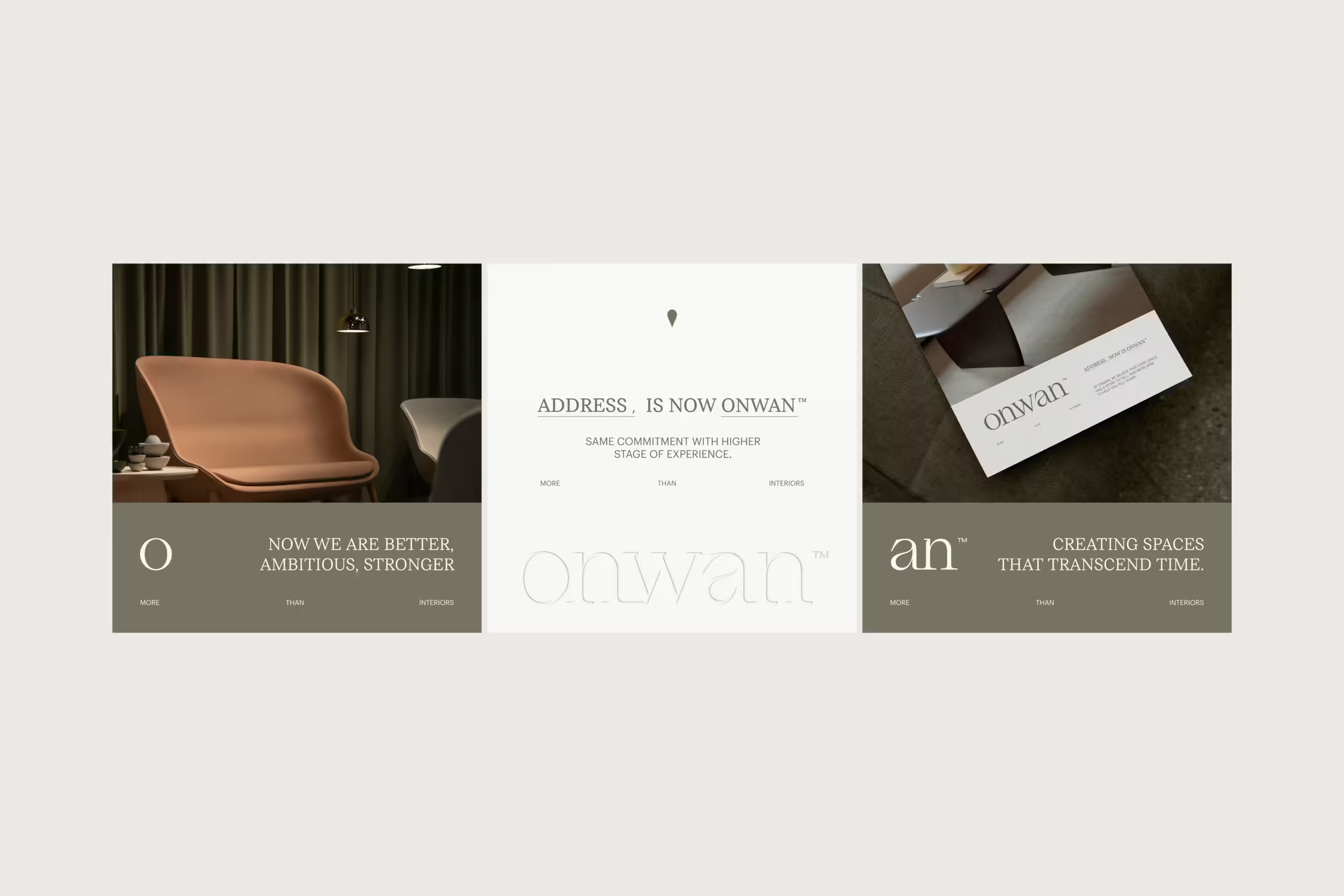
Onwan Interiors, formerly known as Address Interiors, is a leading interior design firm founded by engineer Ahmed Al Samk, known for its innovative vision and unmatched expertise. Renowned for setting design trends locally, the rebrand to Onwan Interiors marks a bold step toward international recognition and a commitment to expanding its creative influence globally.
Services
Brand Identity | Strategy | Naming
Year
2024

New Name
Formerly known as Address Interiors, our company is now rebranded as Onwan Interiors to better reflect our vision and values. The name “Onwan”, which means “destination” or “address” in Arabic, symbolizes our commitment to guiding clients toward their ideal design solutions. This change represents our evolution and our dedication to setting new standards in interior design. At Onwan Interiors, we continue to offer unparalleled innovation and expertise, now with a renewed identity that resonates with our global aspirations.
Logo Animation
The logo animation for Onwan Interiors starts with the “O” which serves as the anchor of the logo, establishing a strong foundation. This design choice emphasizes the importance of simplicity and elegance, reflecting the company’s new minimalistic approach. The animation is crafted with fluid motion, ensuring smooth transitions embody the refined aesthetics of Onwan Interiors. As the animation progresses, subtle movements bring together the elements of the logo, symbolizing the seamless integration and innovative spirit of the company.


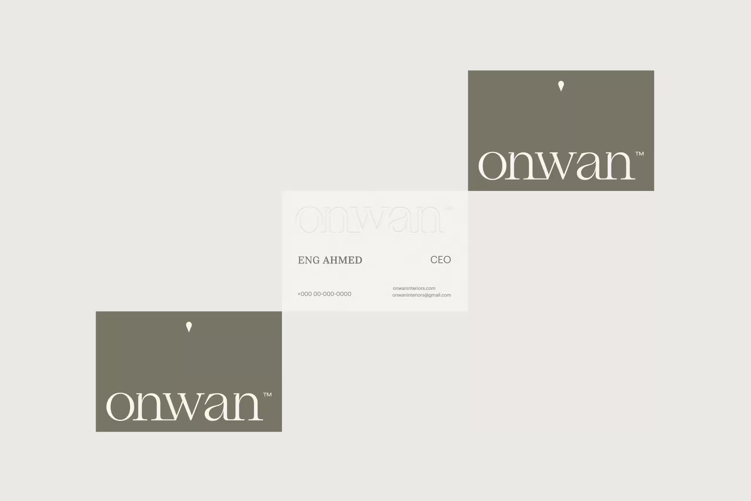
Logotype
Our logotype is designed with sharp dashes at the edges, symbolizing the company's futuristic approach. This phenomenal rebranding offers a distinctly different experience, where every detail of the logo has been meticulously crafted to stand out. The logotype is approachable and easy to read, with optical kerning, refined weight, and a defined clear space. Its carefully delineated placement in relation to other content ensures that it remains instantly recognizable.

Colors
Each color within the palette is carefully selected to evoke specific emotions and associations that resonate with the brand's values and personality. From the comforting warmth of Beige to the calming tones of platinum gray, every hue contributes to a cohesive visual narrative that speaks to the audience on an emotional level.


Work With Us.
Ready to elevate your brand with meaningful, strategic design?
Let’s create something unforgettable together. Connect with us, and let’s begin.
Social
Office
Sunday : Thursday
10am : 5pm
First settlement,
Cairo, Egypt.
© 2025, Sedjem Agency. All Rights Reserved.