Graylabelled
Details
Graylabelled® was born to make modern perfumery more honest and precise. We work directly with tier-one fragrance manufacturers—the same partners behind many designer houses—to create signature-quality compositions without inflated markups.
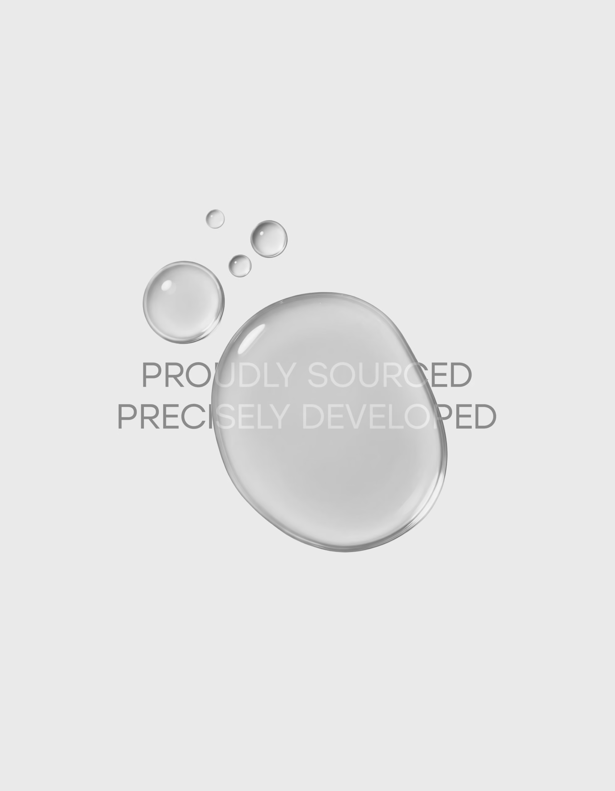
We removed what doesn’t add value middlemen and heavy advertising and reinvested in R&D: material provenance, formula clarity, diffusion, and long-wear performance. Proudly sourced, precisely developed.
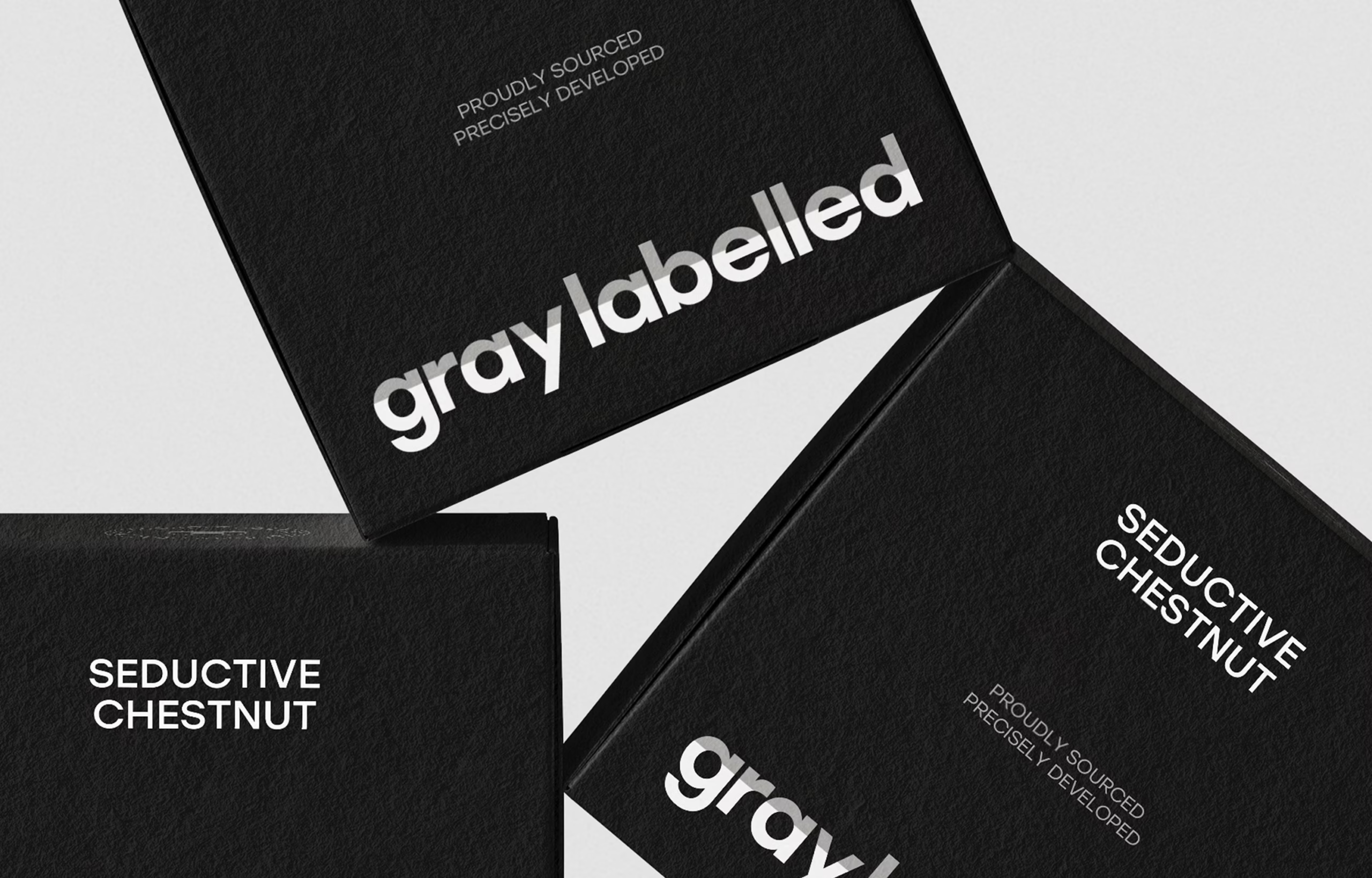
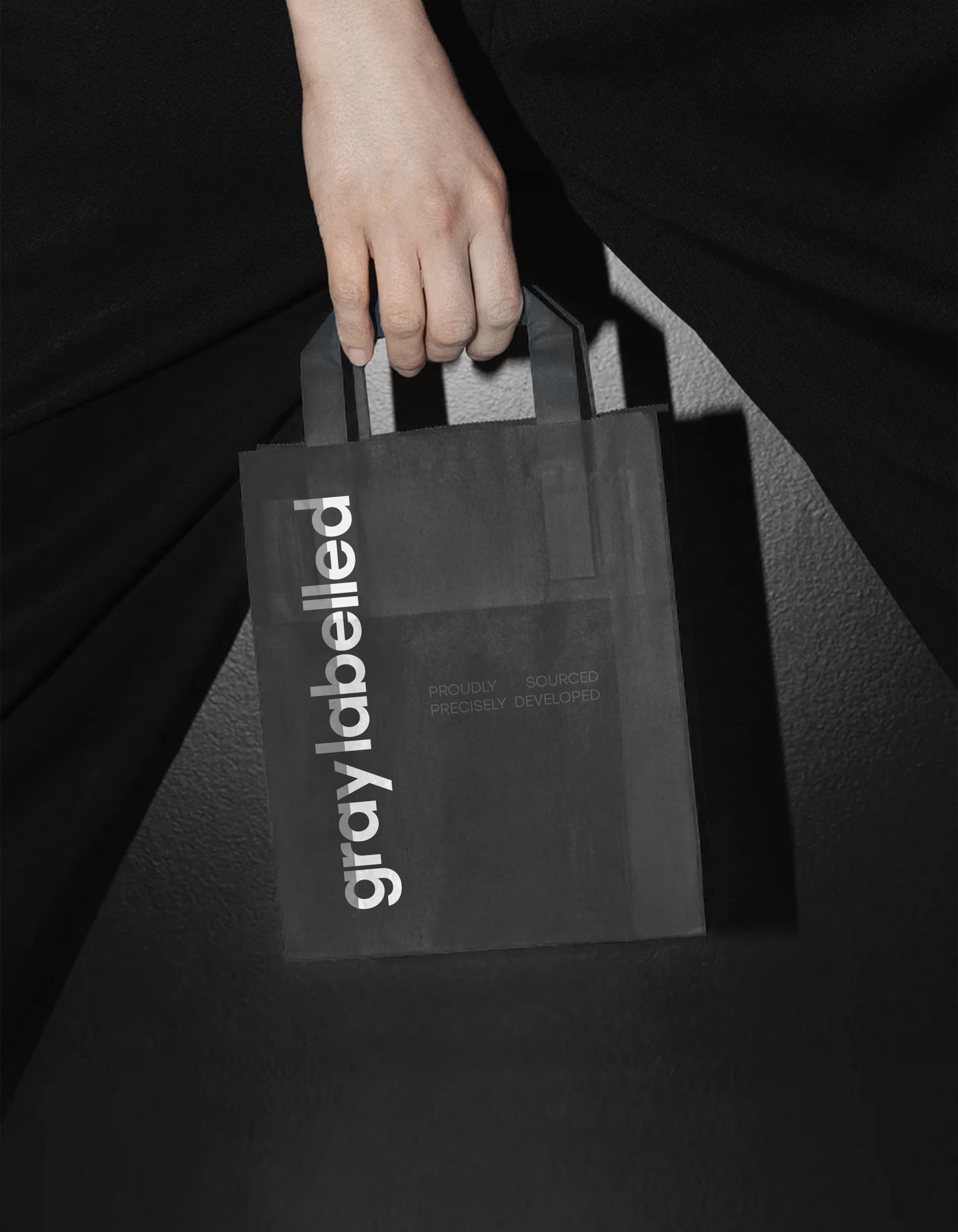
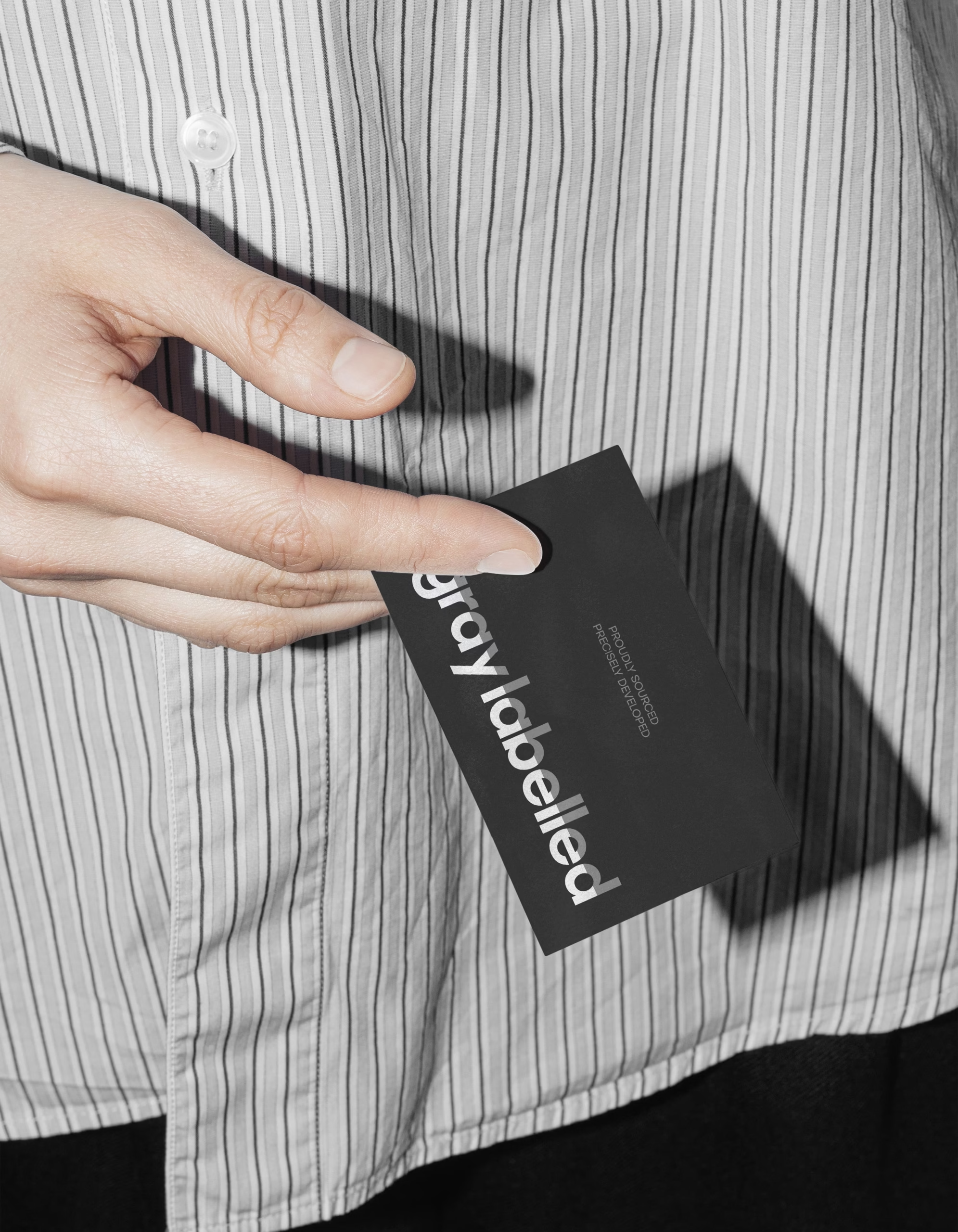
The challenge was to balance restraint and desire: a brand that feels premium yet unembellished. Our solution is a calm, monochrome identity where the label becomes the logo—a discreet lowercase wordmark, refined small-caps scent names, and a tactile matte-black cube with a clean close. Subtle metallic touches and quiet deboss details complete the experience.
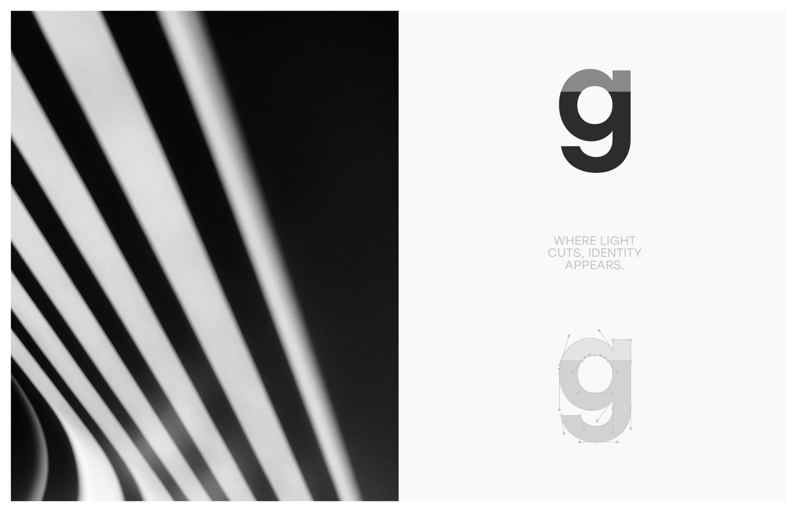
The name Graylabelled captures the attitude: gray for deliberate neutrality; labelled for transparency.
Result: disciplined luxury that lets the fragrance speak—on shelf and on screen.
Services
Visual identity | Packaging design
Year
2024
Wordmark
Core Philosophy & Aesthetic
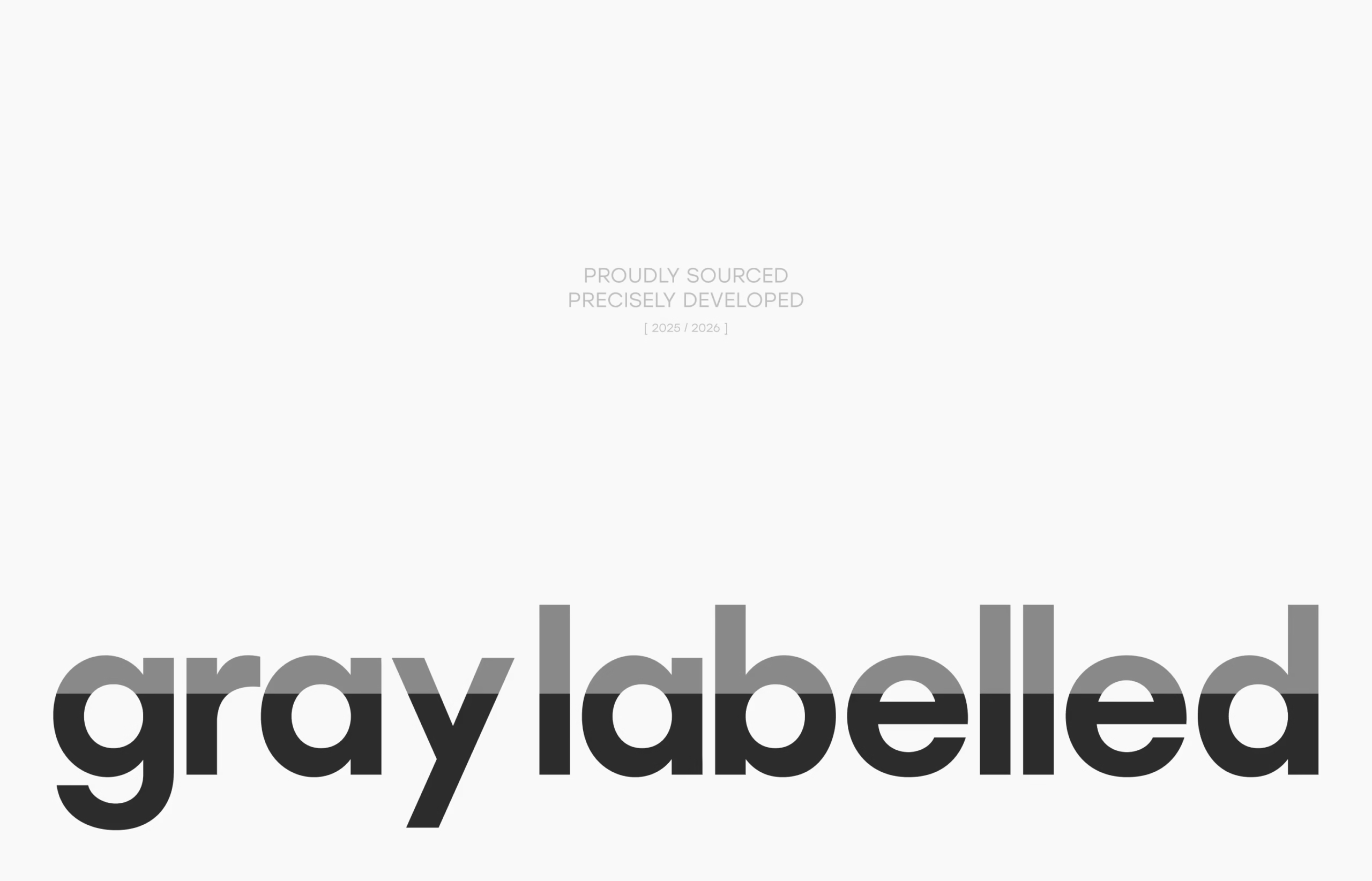
Graylabelled’s wordmark is designed as a quiet act of disclosure.
The calibrated gray-to-black split functions as a visual “line” that separates clarity from depth the label above, the substance below. It reflects the brand’s core promise: remove noise, invest in what performs, and make quality legible.
With a disciplined lowercase typography and controlled monochrome tones, the logo stays premium yet unembellished distinct on shelf, clean on screen, and consistent across every touchpoint.
Functional Utility & System
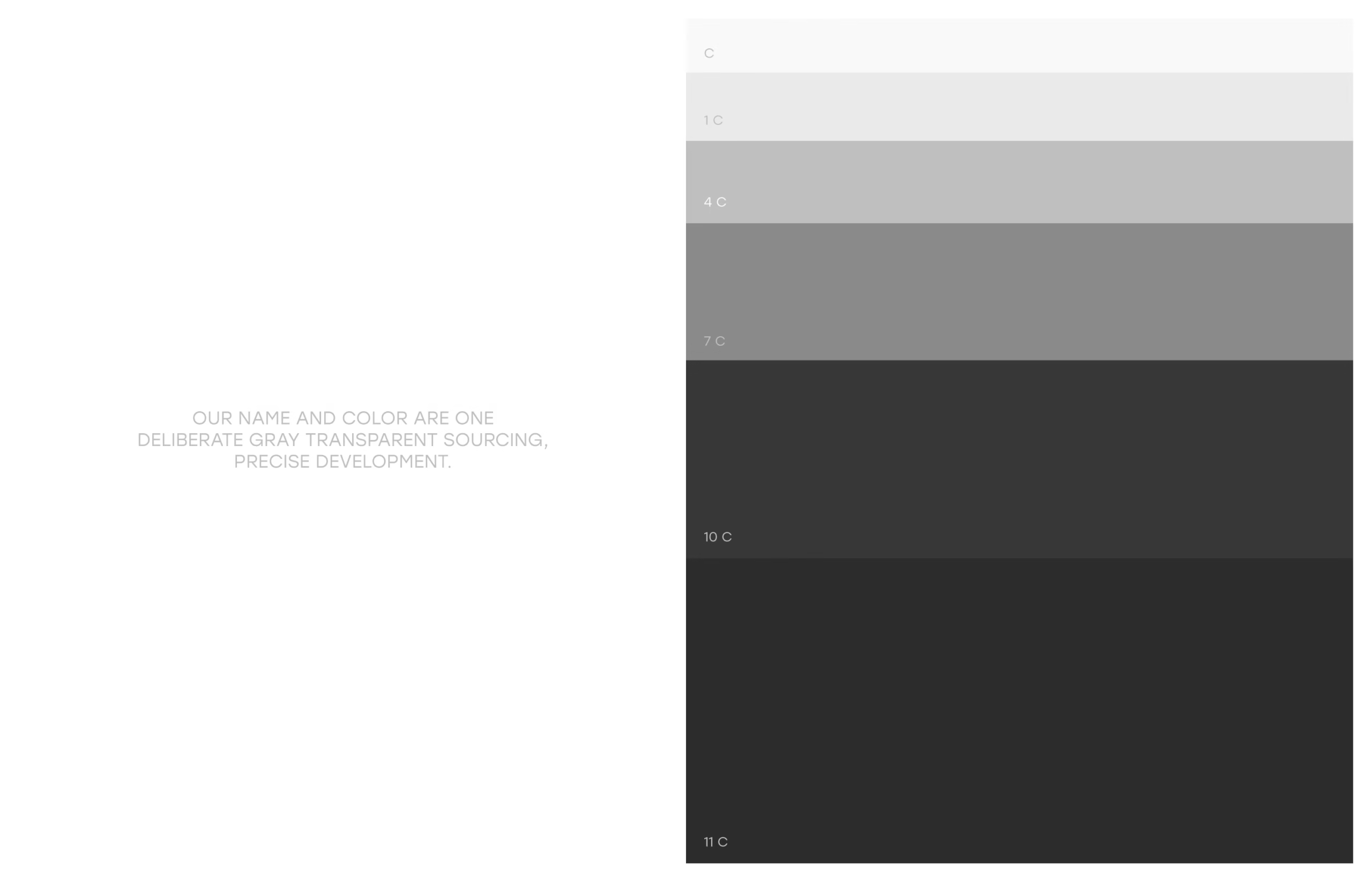
These tones are designed to perform: consistent contrast for typography, reliable reproduction across print and digital, and subtle variation that differentiates products on shelf without introducing new colors.
The system stays quiet, premium, and unmistakably Graylabelled.
PROUDLY SOURCED
PRECISELY DEVELOPED

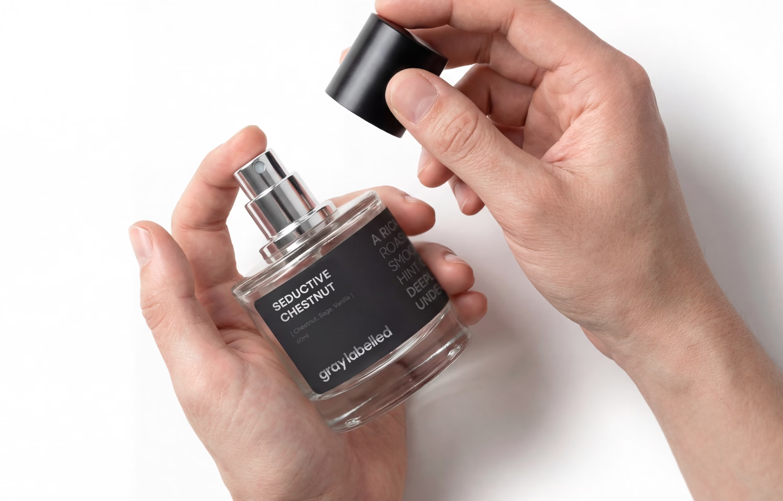
The Primary Vessel
Design Discipline & Clarity
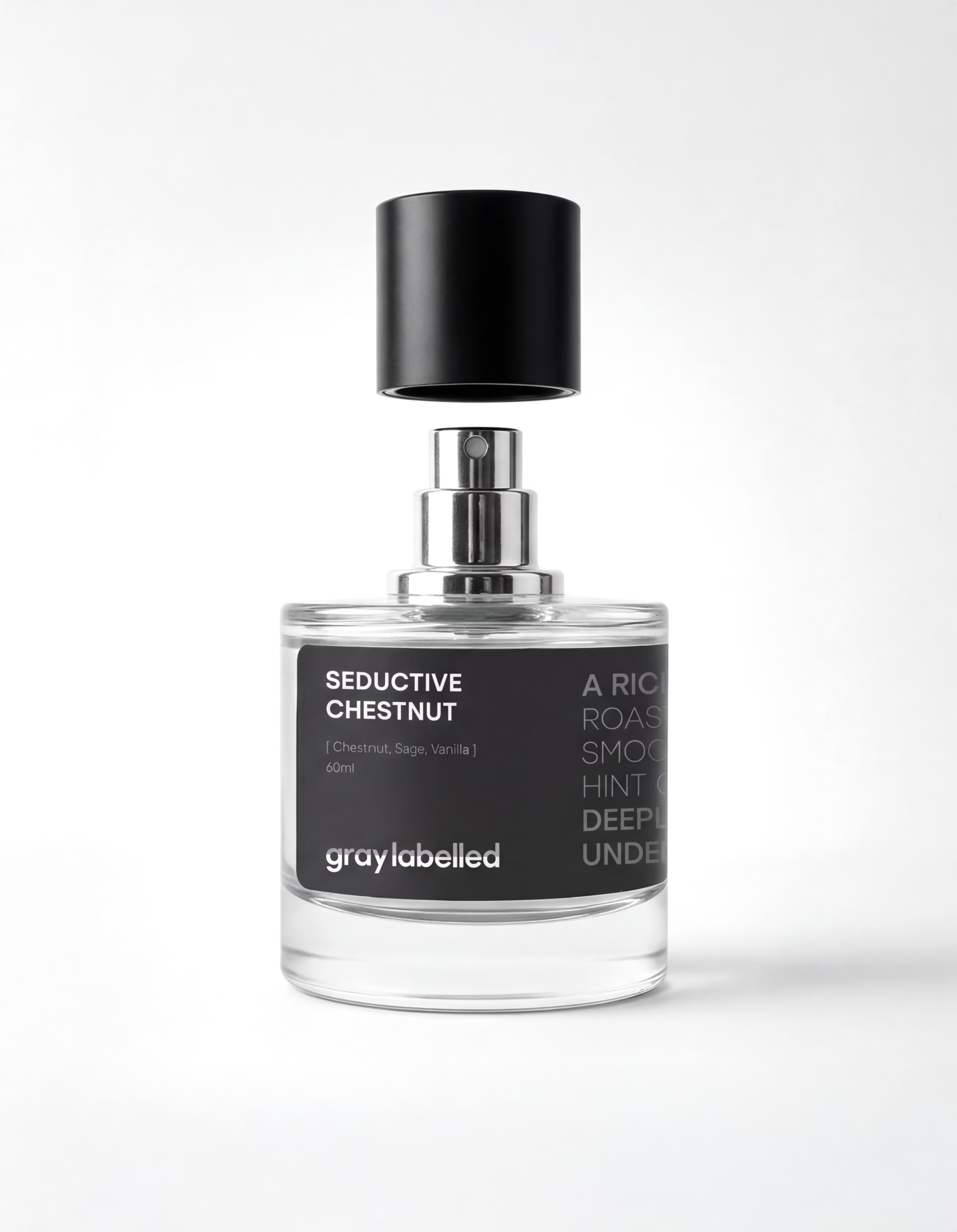
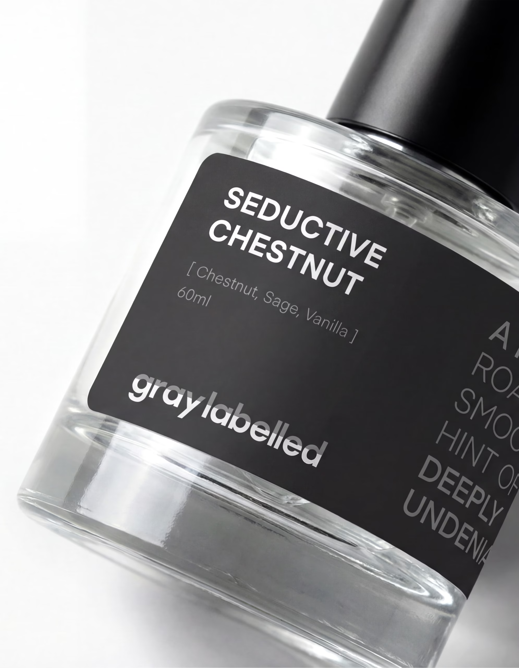
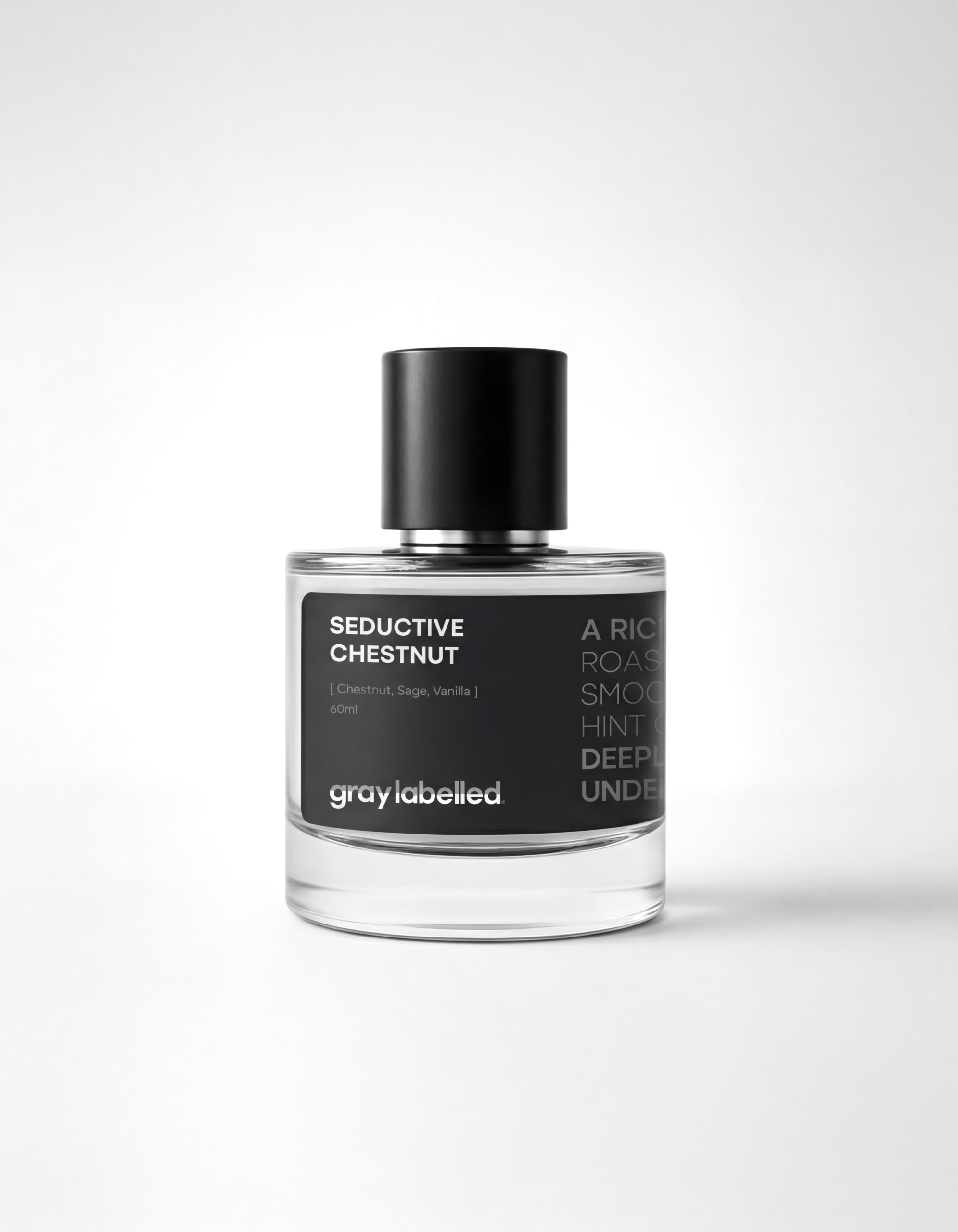
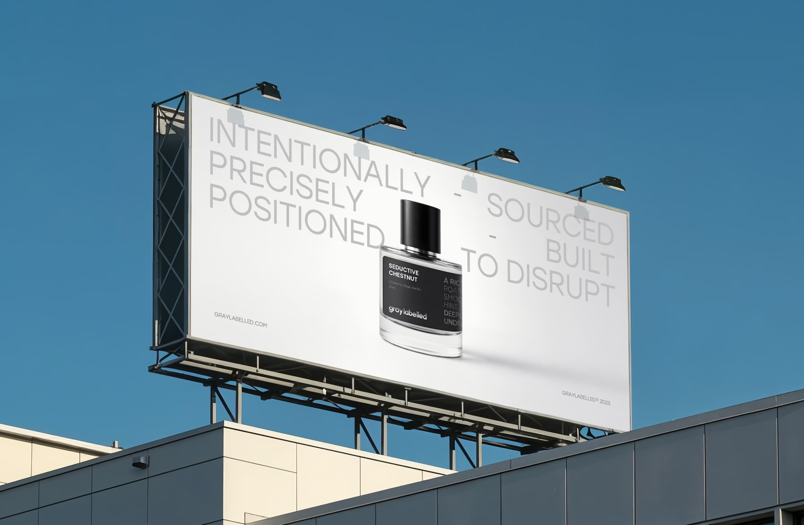
The bottle design follows the same discipline as the brand: clear, functional, and premium without excess.
A transparent glass body keeps the product honest, while the matte-black label anchors contrast and legibility.
Tactile Interaction
The refined typographic hierarchy makes the scent name instantly readable, and the soft-touch black cap completes a tactile, minimal closure built to feel modern in hand and unmistakable on shelf.
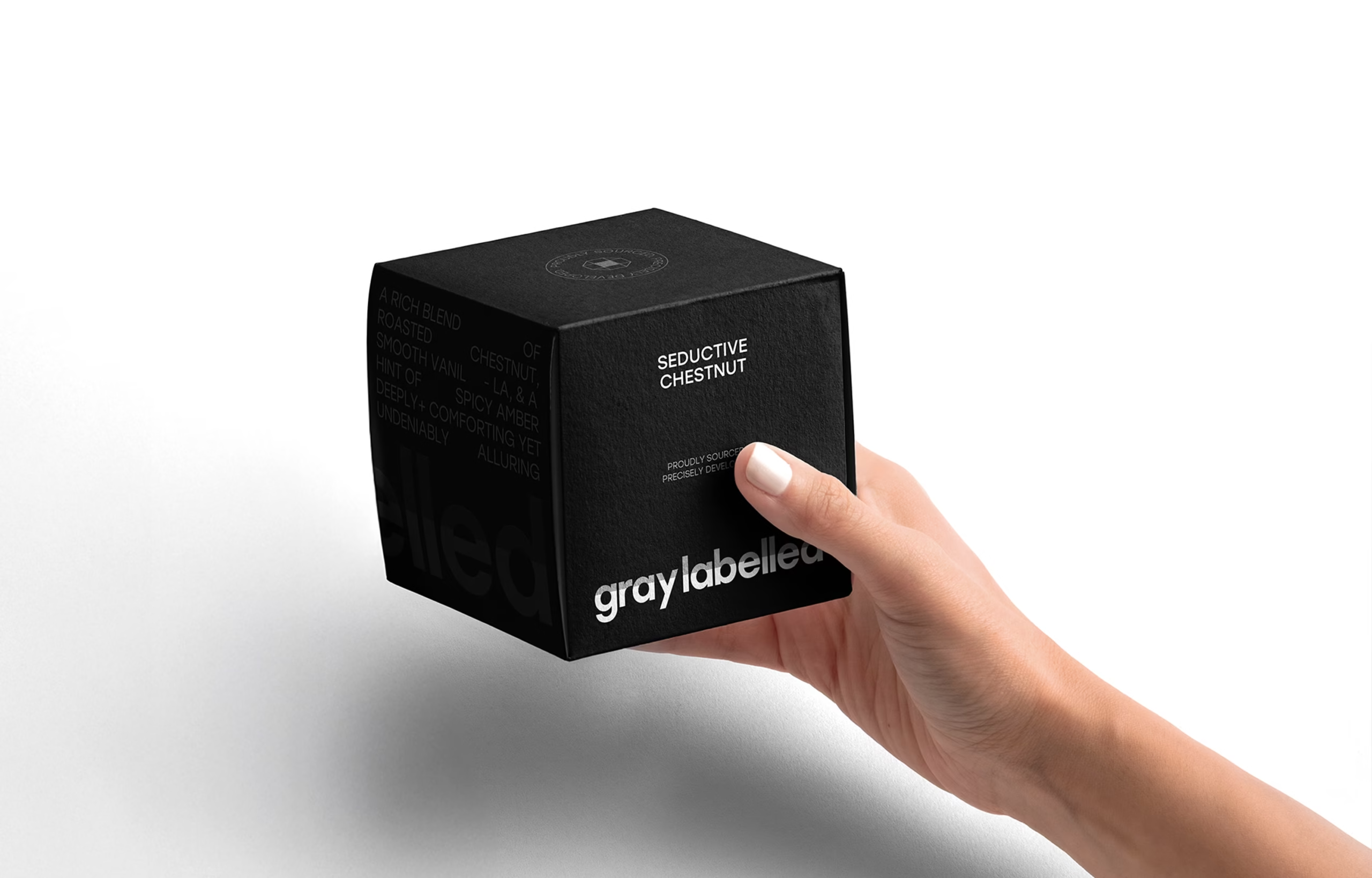
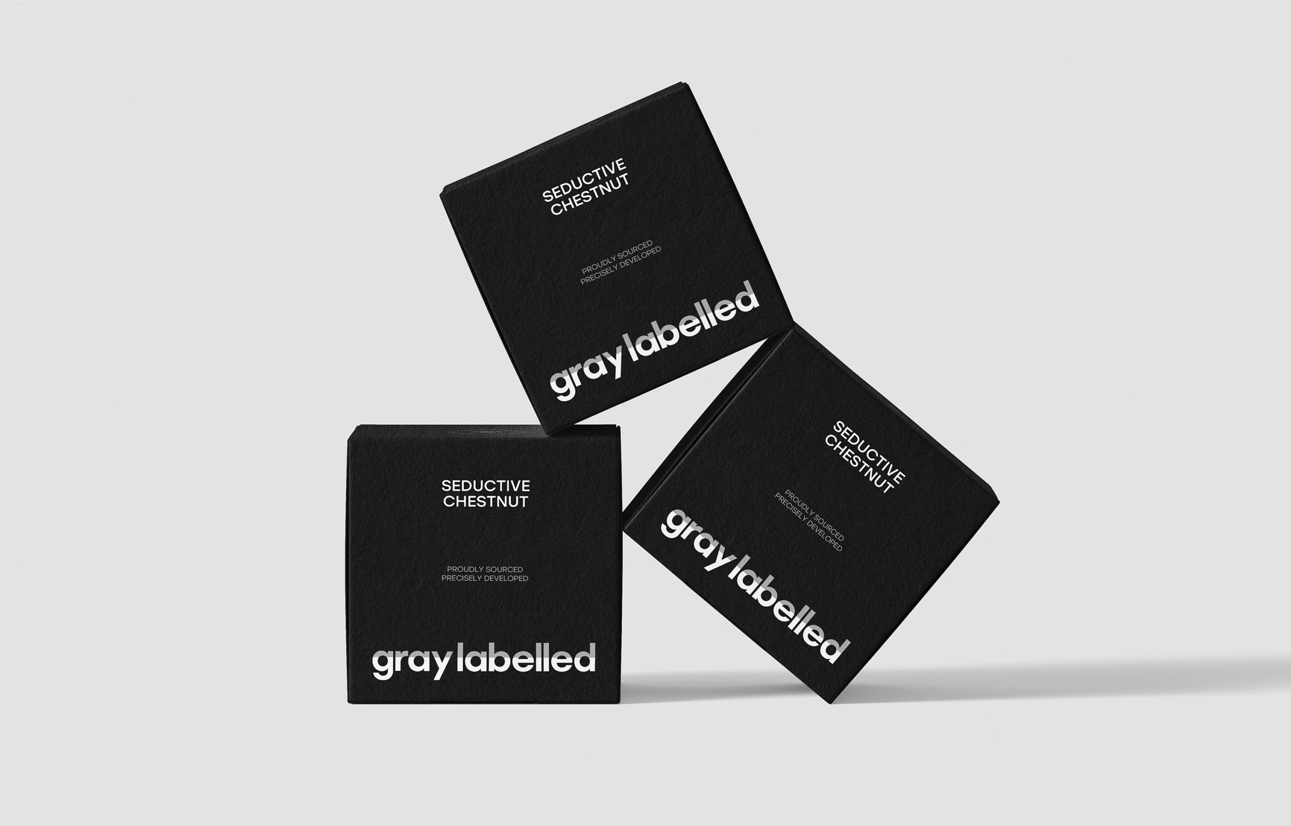
The Structural Packaging
Material Expression
A matte-black cube built for tactile, quiet luxury.
Minimal typography, refined hierarchy, and subtle deboss details reveal depth under light premium without embellishment.
Systemic Cohesion
The packaging is system-led: one structure, a consistent grid, and controlled monochrome.
Each scent stays cohesive within the lineup, while small typographic shifts and finishing touches create distinction without breaking the identity.

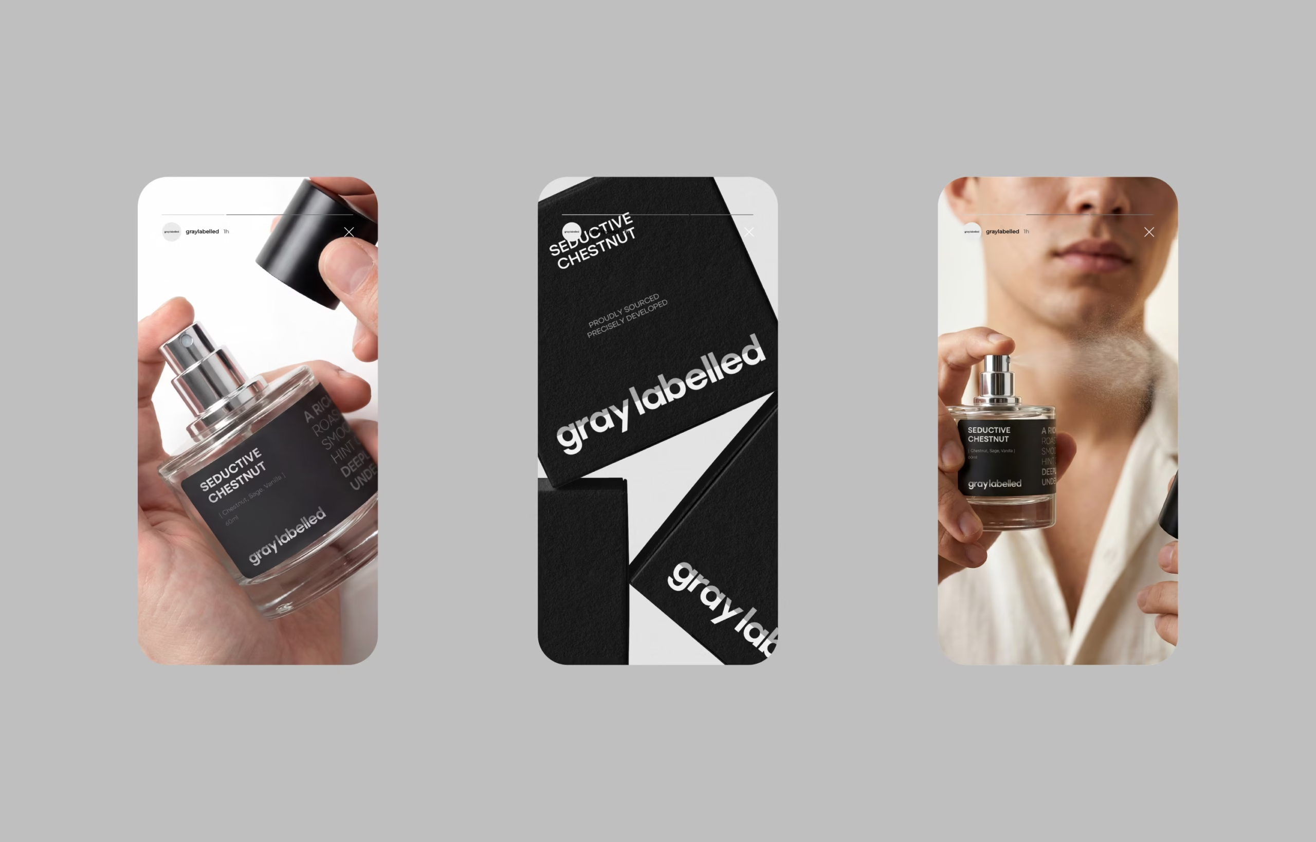
Work With Us.
Ready to elevate your brand with meaningful, strategic design?
Let’s create something unforgettable together. Connect with us, and let’s begin.
Social
Office
Sunday : Thursday
10am : 5pm
First settlement,
Cairo, Egypt.
© 2025, Sedjem Agency. All Rights Reserved.